
Wagway
Making outdoor adventures easier for dog owners and their furry companions

Product Type:
End-To-End Application
Role: UX/UI Designer
Timeline: 100 Hours
Tools: Figma, FigJam,
Adobe Illustrator
🐾 Project Overview
This project started the same way many great walks do—curled up on the couch next to my dog, dreaming of somewhere new to explore. As a dog owner myself, I’ve often found it surprisingly difficult to find outdoor spots that feel like the right fit: not too crowded, safe for off-leash play, shaded on a hot day, or just somewhere a dog can be a dog. I knew I wasn’t alone.
Through interviews and surveys with other dog lovers, I kept hearing the same story—people spending way too much time digging through reviews, scrolling endless maps, or arriving at parks only to find they weren’t as dog-friendly as they seemed. There was clearly a gap: dog parents wanted a better way to plan adventures that matched their pup’s energy level, personality, and needs. So I set out to design a solution.

🧩 The Problem
Whether it’s a high-energy pup who needs space to run or a senior rescue who just wants a shaded place to sniff around, every dog is different. And yet, most apps and websites treat them the same. Current tools don’t offer the filters, real-time data, or thoughtful recommendations that dog owners actually need when planning their days. Information is scattered across platforms, and key details—like water access, leash rules, or terrain—are often missing or outdated.
How might we make it easier for dog owners to discover outdoor spaces that truly match their dog’s personality and energy—while saving time, reducing uncertainty, and creating more joyful moments together?
🕵️♀️ Competitor Analysis
Before sketching out a single screen, I knew I needed to understand what was really happening in the daily lives of dog owners. What did they struggle with? What did they wish existed? And what made them actually excited to go on a walk, a hike, or a little road trip with their pup?
I spoke with 5 incredible dog owners—each with different routines, breeds, locations, and personalities (both human and canine). These conversations gave me so much more than I expected. They were filled with honesty, frustration, joy, and little insights that ultimately shaped every corner of Wagway.
To make sure Wagway could stand out and truly serve users in ways others weren’t, I looked into a few related platforms—both pet-focused and broader outdoor tools. Here’s what I found:

Key Takeaways & Insights
-
There’s a gap between “dog-friendly” and “dog-ready.” Just because dogs can go somewhere doesn’t mean it’s actually suited for them.
-
Real-time info (like crowd levels or weather hazards) would add huge value.
-
A strong emotional connection—the trust that this app “gets” your dog—makes people more likely to return and recommend it.
-
Simple, visual, intuitive filters can turn a stressful planning process into a one-tap joy.
🐕 User Interviews: Dog Owners
Once I had a better sense of the landscape, it was time to dig deeper—to hear straight from the source: dog owners. I wanted to know not just what they do, but how they feel when they’re planning a day out with their dog. What’s working? What’s not? What do they wish existed?
I spoke with five dog parents, each with their own unique lifestyle, location, and pup personality. Some worked from home, others traveled full-time in a van. Some had senior rescues with gentle souls, while others had energetic fetch-lovers who could run all day. But no matter the differences, every conversation circled back to one thing: they wanted outdoor time with their dog to be easier, safer, and more enjoyable.
Here's what I asked during our chats:
-
Can you walk me through a typical outing with your dog?
-
Are there any specific features you look for when choosing an outdoor space?
-
How do you usually discover new places to take your dog?
-
Have you ever struggled to find a good place to take your dog?
-
Have you ever arrived somewhere and realized it wasn’t dog-friendly after all?
-
What information do you wish you had before trying a new park or trail?
-
Would an app that helps you find dog-friendly outdoor spaces based on your preferences be useful?
-
Would you benefit from a feature that shows low-crowd times and water access?
-
How valuable are reviews or recommendations from other dog owners?

"Since I'm on the road a lot, I’ve learned that different regions of the country have different rules on outdoors spaces like certain parks, beaches and campsites. Some aren't as welcoming to dogs as others which has shifted me to avoid certain areas." - Interviewee
These interviews didn’t just validate the need for Wagway—they revealed the emotional stakes. Every dog parent I spoke with deeply cared about making outings special and safe for their furry sidekick. They didn’t want just any place to go… they wanted the right one.
🧠 Synthesizing the Woofs & Wishes
After chatting with my five participants, I had a lot of heartfelt input, insightful experiences, and common frustrations scribbled across notes and voice memos. Each story was full of nuggets—some expected, some surprising—that helped me begin to connect the dots.
To make sense of it all, I created an Affinity Map. This allowed me to group recurring themes, quotes, and pain points into categories that represented key user needs and behaviors. It’s a method I love because it turns raw conversations into actionable insights—and honestly, it helped me better understand what matters most to dog parents, in their own words.
Here’s a peek into how I grouped the feedback:

By stepping back and sorting this feedback into themes, the core opportunities became clearer: Wagway could serve as a centralized, thoughtful, and friendly tool that meets real needs—without all the app-hopping or guesswork.
💭 Framing the Problem: POVs & HMWs
Once I had a strong grasp of my users’ routines, challenges, and wishes, I needed to frame these insights in a way that would keep the real problems at the center of the design process. That’s where POVs and HMWs came in.
By writing Point of View statements, I was able to zoom in on individual types of users and their needs. These statements helped me stay grounded in empathy, ensuring that every feature I brainstormed came from a real voice and a real challenge. Then I turned each POV into a series of How Might We questions, designed to open the door to creative, user-focused solutions.
Here’s a look at a few of the POVs and their corresponding HMWs:
Highlighted POV:
Sarah, a busy dog mom who wants to find quiet and dog-friendly spaces without wasting time searching across multiple apps and websites.
View full list of POVs
Highlighted HMW:
How might we make it easier for users like Sarah to quickly discover
dog-friendly outdoor spaces in one place?
View full list of HMWs
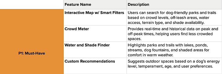
These POVs and HMWs helped shape Wagway’s core functionality—from the search filters and favorite spots to features like the crowd meter and user reviews. They gave direction to the design journey while still leaving room for creativity and iteration.
Click the image below to view the full Feature Roadmap:
👤 Meet Sarah: Our Core Persona
After gathering insights from a diverse group of dog owners, one user profile kept emerging with clarity: a busy, caring pet parent trying to make the most out of her outdoor adventures without the stress of endless searching.
And so, Sarah Thompson was born—our guiding light throughout the entire design process.

Sarah isn’t just a fictional character. She’s a thoughtful blend of real stories, needs, and habits uncovered during user interviews. She represents the kind of user Wagway is made for: someone who loves her dog like family and wants to find joy in the small moments they share outside.
🗺️ From Sarah’s Needs to Wagway’s Flow
Once Sarah’s story came to life, the next step was translating her goals into a clear, intuitive structure that would support her journey. The goal? Build something simple and supportive—something that feels like a natural extension of how she already navigates her day.
Armed with insights from our user interviews and Sarah’s persona, I began mapping out the essential screens and features that would help users like her find, save, and revisit dog-friendly outdoor spaces. This meant organizing information in a way that felt familiar, yet still delightful and efficient.
Site Map:
The site map was built to prioritize discovery, usability, and personalization.

Task Flow:
With the structure in place, I built a task flow centered around one of Sarah’s core tasks—finding a dog-friendly outdoor space with low crowd levels.

This flow reinforces Sarah’s desire for ease, clarity, and trust.
The “happy path” keeps the number of clicks minimal while still giving her enough context to feel confident in her choice.
🖍️ Sketching It Out: Lo-Fi Wireframes
Once the task flows were solidified, it was time to bring Wagway to life. With Sarah’s needs top of mind, I began translating key moments in her journey into low-fidelity wireframes. This was the space to explore layout ideas, simplify interactions, and ensure the app supported users like Sarah without unnecessary friction.

These wireframes helped test assumptions and refine the structure before any high-fidelity design work began. Rather than polishing details, I used this phase to prioritize usability, simplicity, and real-world context.
It was less about pixels—and more about purpose.
🎨 Building the Look & Feel: Branding & UI Kit
After shaping the structure of Wagway through wireframes, it was time to bring the brand to life—visually. I wanted Wagway to feel just like the experiences it supports: inviting, grounded, and full of playful energy.


To ensure consistency, I built a UI Kit that includes buttons, input fields, and icons. Each component was designed with usability in mind, from generous tap targets to clear visual hierarchy.
📱 From Sketches to Screens: Hi-Fi Wireframes
After defining Wagway’s visual identity and refining the user experience through low-fidelity wireframes, I was ready to bring everything to life with high-fidelity designs. This was where all the thoughtful decisions—guided by Sarah’s needs, the research insights, and Wagway’s grounded yet vibrant branding—finally came together in a tangible way.


Contrast, readability, and touch targets were carefully considered throughout. Whether users are exploring a trail in bright daylight or scrolling late at night, the UI is designed to be legible and responsive—offering an experience that’s truly inclusive.
🧪 User Testing: Hi-Fi Prototype
With Wagway’s high-fidelity prototype ready, I knew it was time to step away from the designer’s desk and put the app in the hands of real users. After all, this project was always rooted in making dog parents’ outdoor adventures easier, joyful, and more informed.
Participants were given a realistic scenario where they needed to find a park using the crowd meter and save it to their list of favorites. The goal was to evaluate how easily users could complete this journey, identify any pain points, and gather feedback on accessibility, usability, and overall experience.

What We Learned:
The test confirmed that Wagway was on the right track. The task flow was largely successful, and users found the app both helpful and easy to use.
However, the testing also highlighted subtle areas for improvement, like reinforcing tappable elements on the Map screen and offering real-time weather updates.
🔁 Iterations
The usability testing phase was incredibly insightful and reaffirmed many of the decisions made throughout the design process—while also shining a light on meaningful ways to elevate the experience even further.
Here are a few iterations that were made:
*Enhanced the Map Screen: Before & After


Added a multi-select filter to support compound filtering
Added a paw print tooltip to help users understand the map better
*Refined Details Screen


Users felt that useful info (ex: trail type, and water access) should be included and prominently placed
Users expressed a desire for real-time weather updates
These iterations not only reflect user needs but also push Wagway closer to being a truly thoughtful and empowering tool for dog parents on the go.
As the design evolves, I’ll continue grounding every decision in feedback, empathy, and real-world scenarios—just like Sarah’s.
🐾 Paws & Reflect
Looking back on this project, Wagway turned out to be so much more than just a UX case study—it became a reflection of the kind of product I’d genuinely want and use in my own life. As a proud dog parent myself, I found so much joy in speaking with others who share that same bond with their pups, and their stories became the heartbeat of this experience.
Throughout the process, I gained a deeper understanding of how thoughtful design can meet everyday needs in simple but meaningful ways—like cutting down research time, helping people feel more confident in their outings, or even just knowing where to find a quiet trail or a splash of water on a hot day.
I grew a lot throughout this journey—not just in terms of tools and workflows, but also in how I think about empathy, accessibility, and the little details that make a product feel intuitive and trusted. While there’s always more to improve, I’m incredibly proud of how Wagway came to life and excited by the possibility of where it could go next.
